Figma / Adobe Illustrator / Adobe Photoshop / Miro
Student Research and innovation
The Industry-academic corporation project
project
The Daniels Corporation project is a project to build a kitchen appliances share system (called “The Kitchen Library”) and application for a specific condominium, including digital and physical space. This project was a part of the industry-academic corporation at George Brown College Research and Innovation. This project is divided into two phases.
The Daniels Corporation
Office of Research & Innovation
https://www.georgebrown.ca/about/office-of-research-innovation
https://www.georgebrown.ca/about/office-of-research-innovation
Position
UI/UX Designer & Researcher
Role
User Research
System Design
UX / UI Design
User Research
System Design
UX / UI Design
Challenges
"How might we solve safety and reliability problems without human intervention”
Each condominium will have different property managers. Thus, it was essential to create a platform that could easily be used by these management companies as well as to keep consistency and reliability on the Daniels Corporation brand.
The First Phase Goals:
Defining requirements for the kitchen library system.
Provide branding, UI design proposals and click-through prototypes for main feature UIs.
Research potential technologies to build appliance cabinets for the kitchen library system.
The Second Phase Goals:
Research and design effective, efficient and accessible cabinets for two different towers.
Provide a functional front-end mobile application that is useful, usable and desirable.
Provide an administration management platform application for the Daniels Corporation and each property manager.
solutions
Precedents / Personas
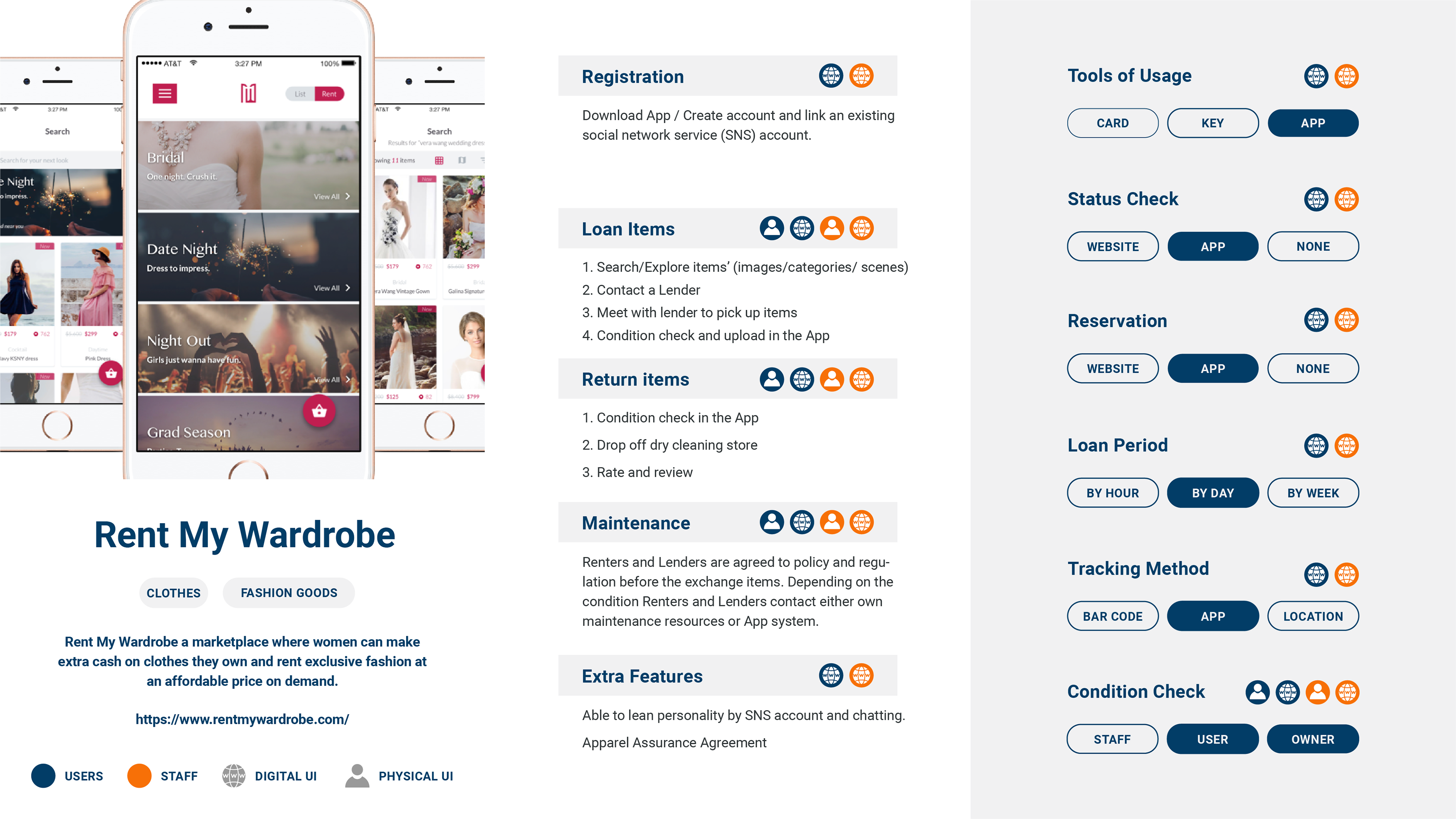
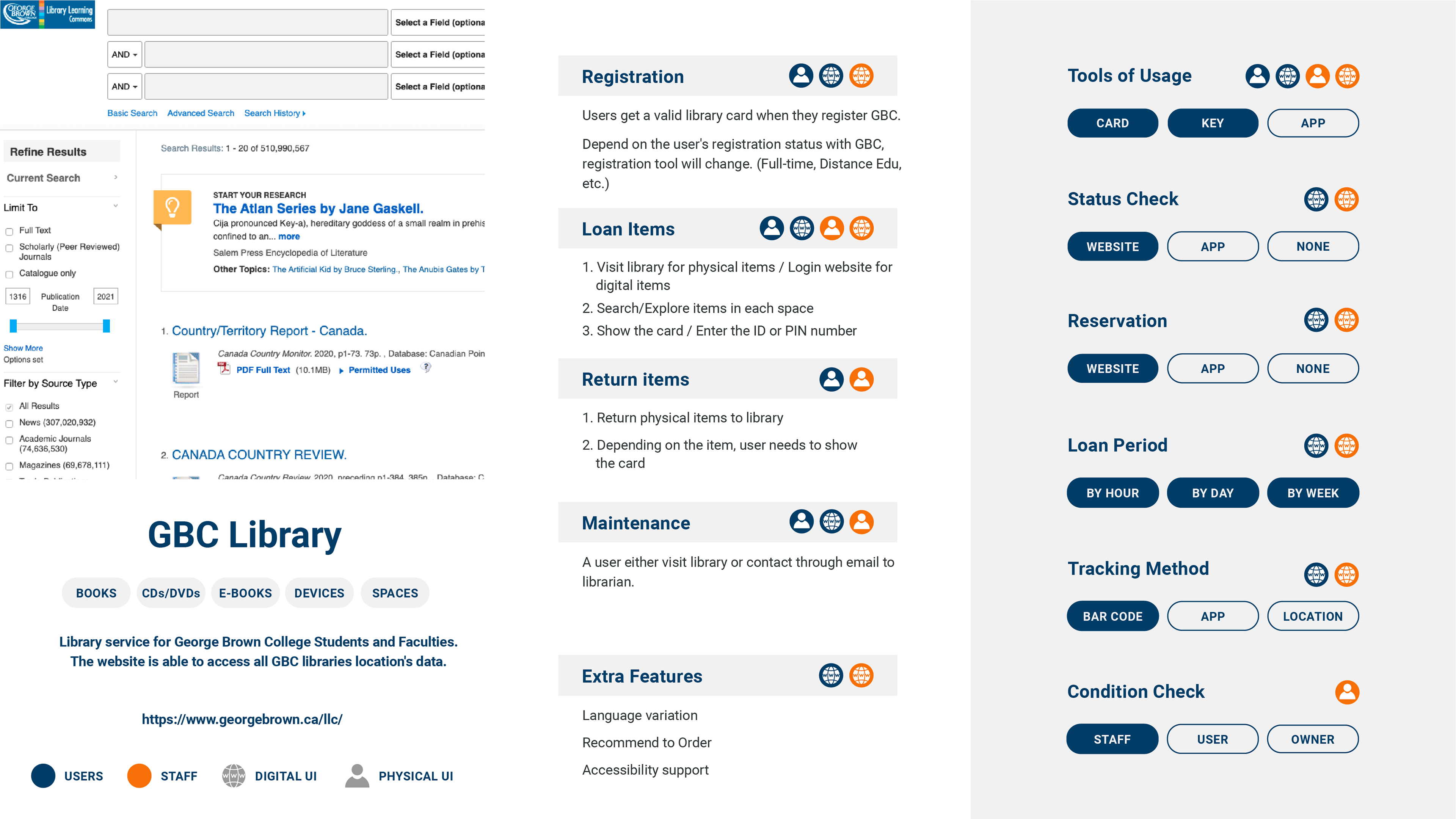
We researched precedents of the physical object-sharing services and systems to define User tasks, Computer Tasks and Interaction Points.
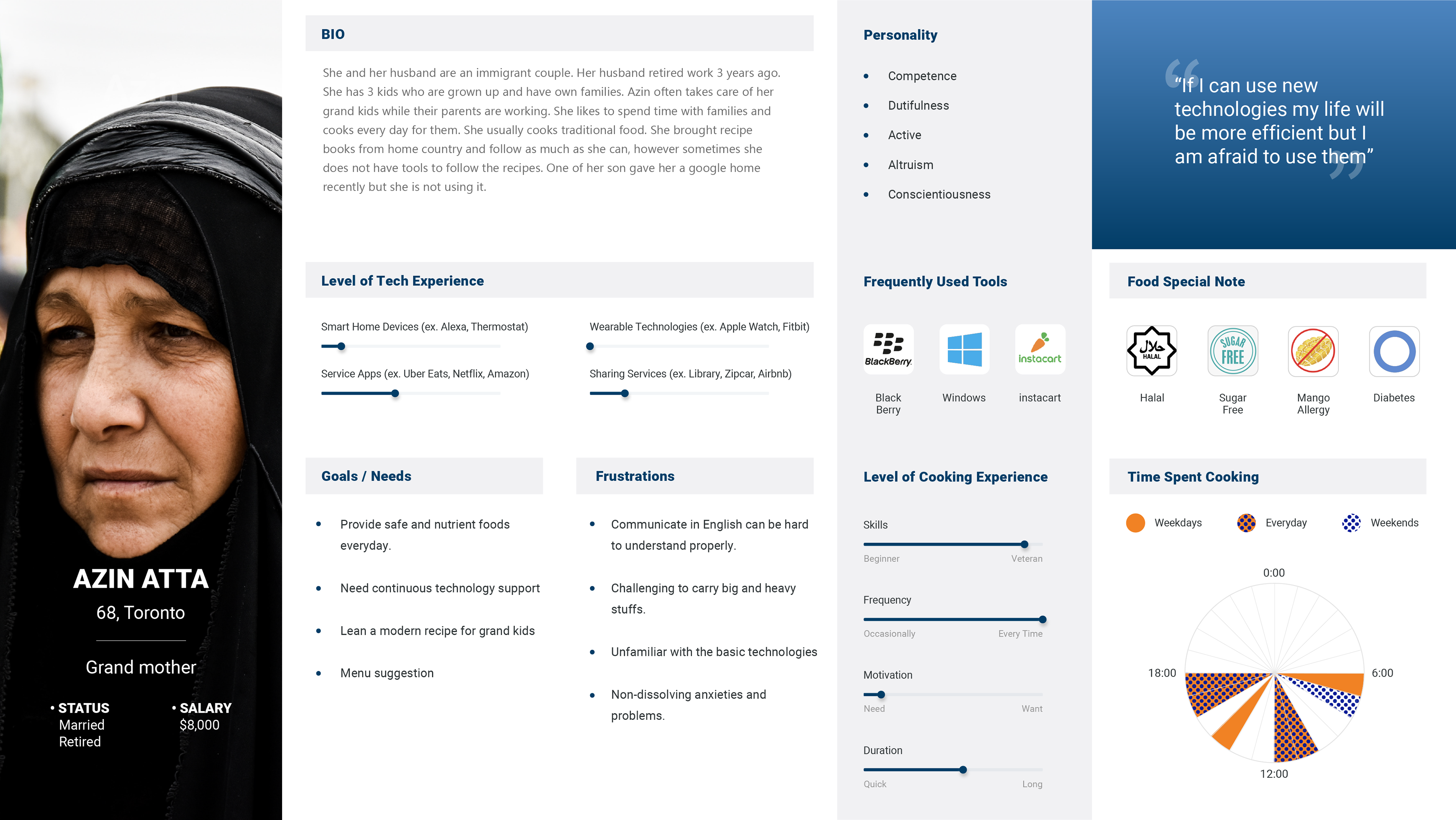
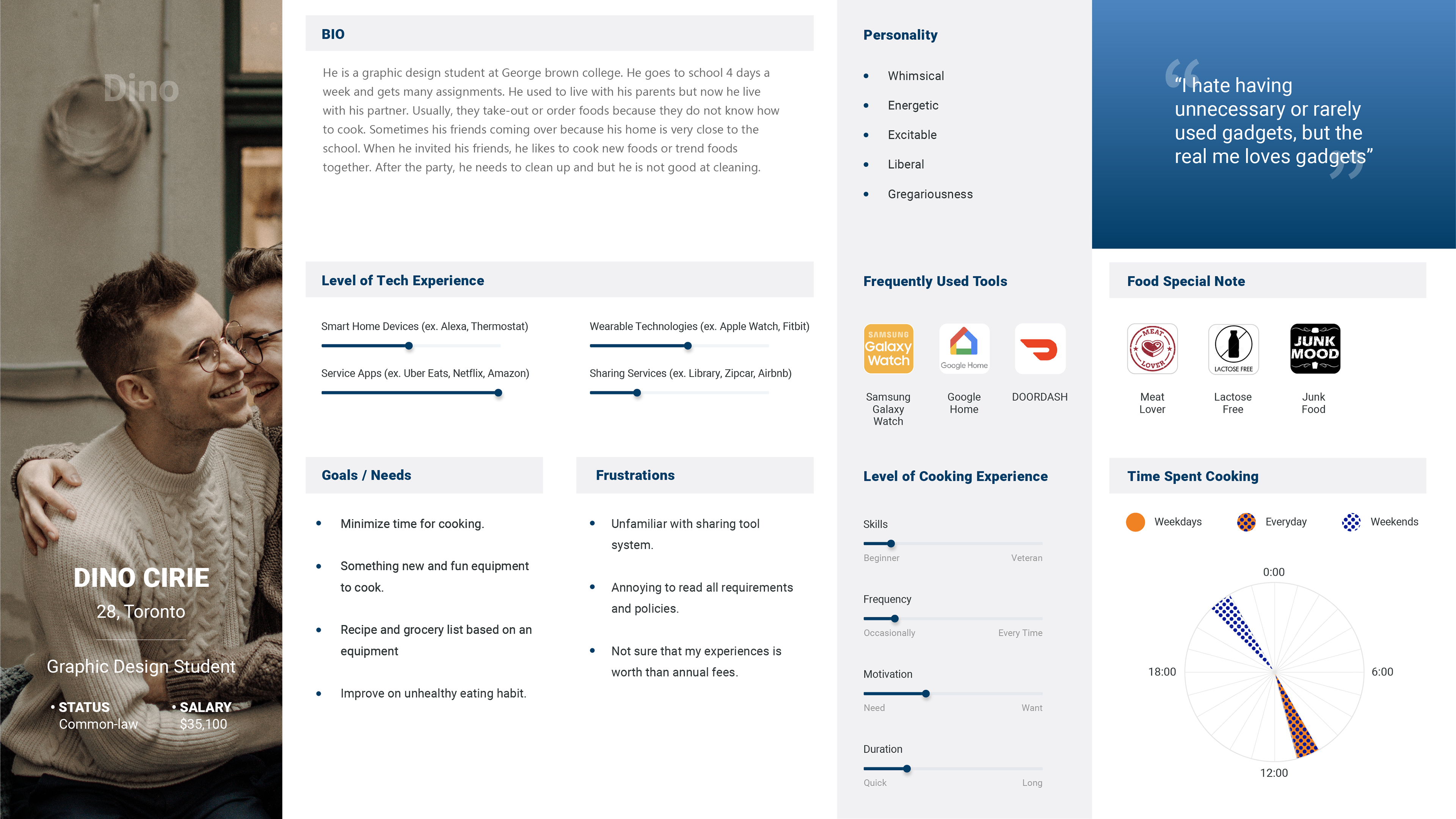
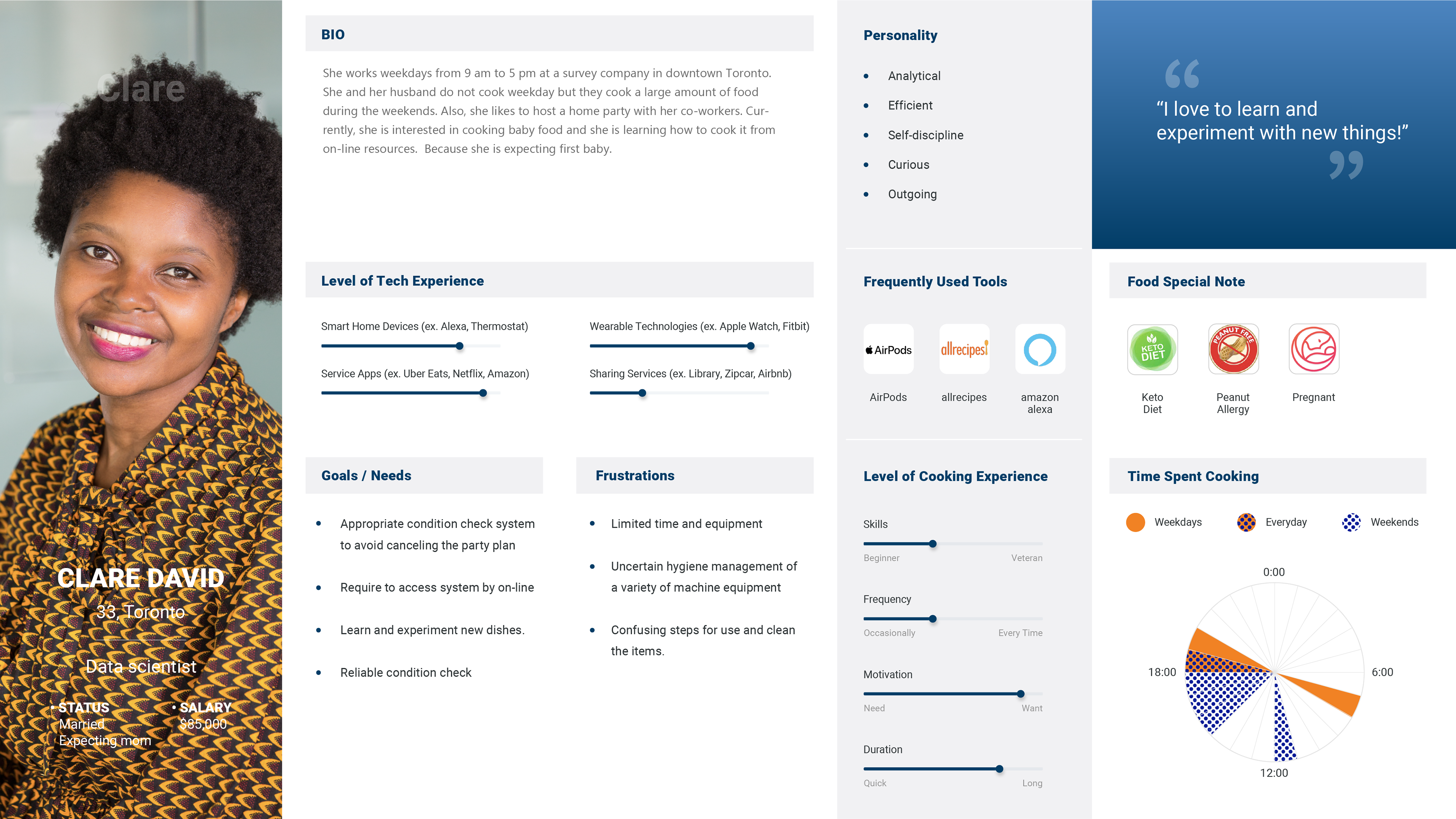
Besides, we created personas based on the data from the client, the condominium resident statistics in Toronto, and the information on the area where the condominium is to be built, to find the user needs.
In personas, we decided to include data on "Food Restriction" to highlight possible problems and the importance of safety and "Cooking Time" to consider different user needs.
System Map / Task Allocation Analysis
Precedent research allowed us to understand basic user flow, the system requirements and the allocation of tasks on humans and computers.
From these research outcomes, I designed a system map to visualize the interaction between each component. We choose three different types of precedents
1. Assigned a lot of tasks to humans in physical space.
2. Assigned a lot of tasks to a computer or human in digital space.
3. Assigned tasks evenly in physical space and digital space.
to analyze and find the best option for the client.
1. Assigned a lot of tasks to humans in physical space.
2. Assigned a lot of tasks to a computer or human in digital space.
3. Assigned tasks evenly in physical space and digital space.
to analyze and find the best option for the client.
Conducted Workshops
We designed a workshop with previous materials and research data to understand the client’s goals, values and vision. I was in charge of designing an Isometric Map to visualize UX flow.
The Isometric Map allowed us to understand the overall view of the system to find the needs of each space, allocation of tasks and possible problems.
The Isometric Map allowed us to understand the overall view of the system to find the needs of each space, allocation of tasks and possible problems.
Mobile Application Design
I organized information and requirements for the ideal UX to define the mobile application's optimal functions. This activity clarified digital UI, physical UI, data and automated actions.
After identifying requirements, sketched the concept design of the UI system.
We provided three design proposals based on the outcomes of the workshop and each designer's concept. Each design includes Moodboard, UI kit and selected UI.
I created concept 3. My concept key is Surrounding, Bright and Natural.
The Kitchen Library is always around and blends into the users' life naturally and brighten the cooking experience.
The feature of this idea is that the users can browse the contents of their interest regarding cooking. This feature enhances the users' interaction with the mobile application not only the time they rent kitchen appliances but also when they think about the dinner menu.
Designing / Prototyping
Design application interface starting with a very rough sketch. We selected main functions screens to develop interface design.
+ Login
+ Profile
+ Application Landing Screen
+ Reservation Item
+ Renting Item
+ Returning Item
+ History
+ Profile
+ Application Landing Screen
+ Reservation Item
+ Renting Item
+ Returning Item
+ History
At the low-fidelity UI design phase, we ideate whats are the required action at the screen. During the low-fidelity design iteration phase, we also ideate require data. Transforming low-fidelity to high-fidelity, we researched best practices, design principles and usability guidelines.
Technology Research
To reduce the labour cost and keep security, we are required to implement an auto-lock cabinet for kitchen appliances. Using existing door locks had a problem syncing our mobile application. Thus, we needed to create the cabinet door lock on our own.
This cabinet required technologies the door lock to limit access user and the weight sensor to recognize the status of an appliance.
We recommended Arduino to our clients because it is easier to get and more affordable than the existing door locks in terms of cost.
This cabinet required technologies the door lock to limit access user and the weight sensor to recognize the status of an appliance.
We recommended Arduino to our clients because it is easier to get and more affordable than the existing door locks in terms of cost.
Cabinet Configuration
Before building the kitchen appliances’ cabinets we size and configuration options. I used existing anthropometry data to demonstrate height and user reach in sketches. As a result of research discovered that the use of steps was not always safe, and that space was required to create a safe slope. Overall, we suggested that the cabinet should be made low height to improve accessibility.
Also, I researched accessibility and safety using cabinets. From the research, I discovered that the weight to lift one hand should be 2.5kg or less for safety reasons.
outcomes
In the first phase of user research, we pointed out that keeping clean appliances impacts user experience and brand trust. Since we are not positioning anyone in the kitchen library space, this system requires users to inspect appliances themselves to keep quality.
The first idea was to add a detailed checklist on each appliance's inspect UI. This idea focused on safety. However, this UI design consumed time and action to complete. To keep usability and safety, I created options for users that how they inspect appliances. In this solution, the users can select based on their needs how much time they want to spend inspecting the appliance for their safety.
I created a UX scenario video with Adobe After Effects and a clickable prototype with Figma for the Daniels Corporation and development team to finalize development to release the kitchen library system. The mobile application will be published soon in the app store.
